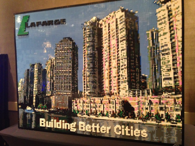
As part of their recent Western Canada Convention, the good folks at Lafarge contacted about being part of the festivities. We shared some ideas, and came up with the idea of creating a large scale mosaic on site during the convention, as well as building some centerpieces for the tables.
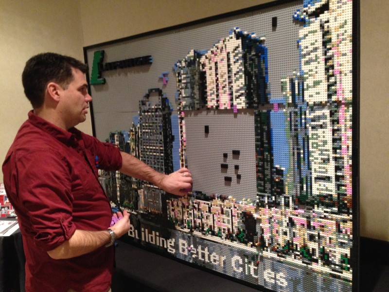
Over the course of two days, I build the mosaic on site. Due to time constraints, the piece was partially pre-built. You can see the purple colored bricks on the piece. These were used as spacers to hold the baseplates in place while I build the “connectors” over the gaps in the baseplates. For this build, we (Mrs Brickwares and I, mostly her though) built a new kind of stand that allowed for putting pressure on the front of the piece.
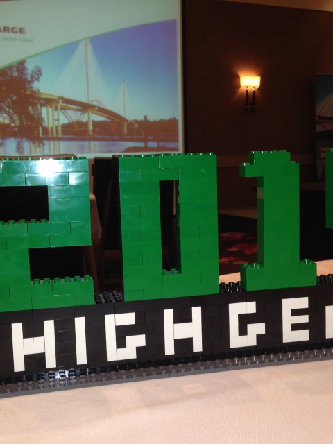
Each table in the room had a “High Gear” centerpiece on the table. They certainly inspired the attendees to do some creative rebuilding during the event. A fiarly simple design to the eye, but it took a bit of time to ensure the stability and make sure everything connected to itself. The numbers at the are a bit on fragile side, but that adds to the pieces, I think.
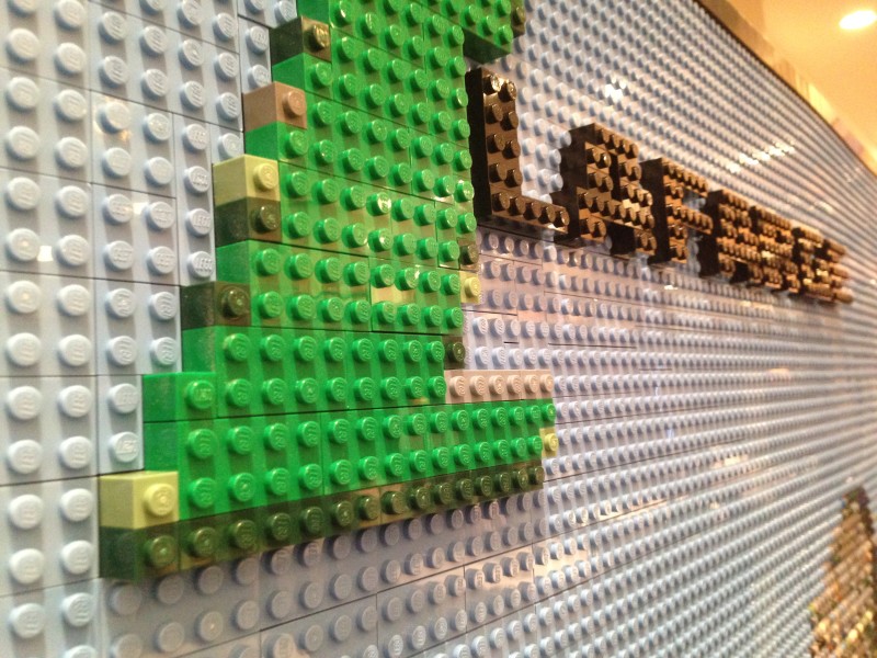
A close-up shot of the company logo. Surrounded by a sea of Medium Blue. The black lettering, and the “L” are one brick higher than the rest of the piece, which again adds the necessity to lock the bricks so that they can’t be pulled out as easily.
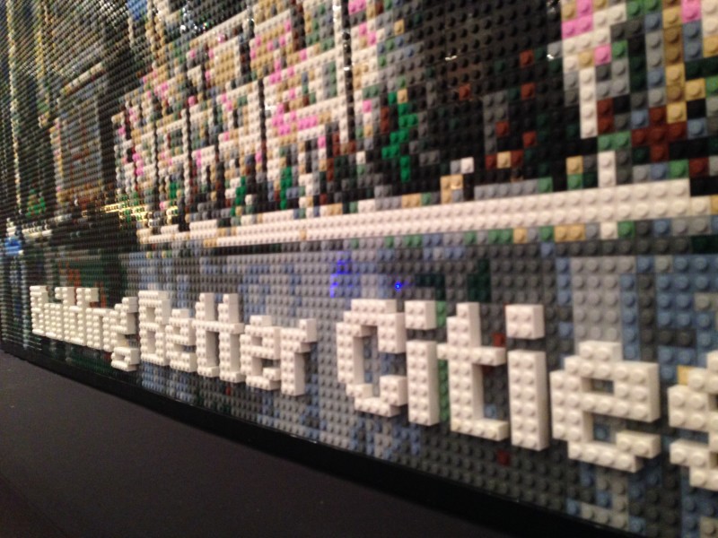
Raised text for the tag-line. I’m becoming a bit fan of the raised technique. It increase the amount of brick, but it really makes the writing stand out. You can also get a better appreciation for the size of the piece, and how small each stud in in this shot.
The finished piece. This was a demanding build, with a lot of areas containing a variety of colors in close quarters. I really like the mix of cooler and warmer colors, finally a good chance to you that pink brick to good effect. The attendees were constantly trying to guess which city it was.
0 Comments
Would you like to share your thoughts?