(This entry is part of a look at early mosaics I’ve made).
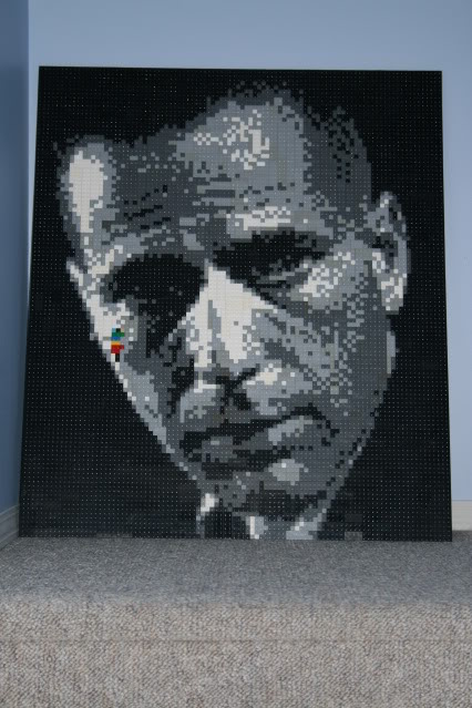
For the next project, I decided to look for icon black and white protraits, and found one of Bogart that I really liked.

i used a different diffusion, less of the “x” pixelation to create detail, and more use of “like colours”, which tend to make things more realistic, but less detailed.
I set off to work, and over the course of a few nights, had most of the face complete.
Now, you’re probably asking yourself “what’s up with the parrot-like colours on bogey’s cheek”? Well, here’s the story. My erstwhile assistant, Finny, decided to add to the mosaic one day, while I wasn’t around. I saw it, and it made me laugh. And then, for whatever reason, I decided to leave it in. Call it “artist’s prerogative”, call it “found art”, call it what you will. It stays.

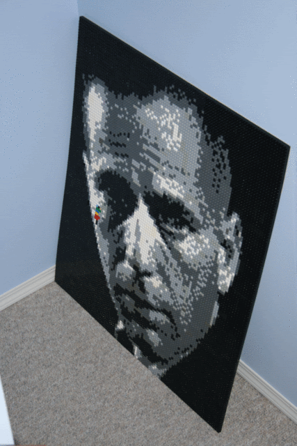
A shot from the side, you can see the “parrot” more clearly here. It’s always interesting to me that the pictures taken of the mosaics can be so different, as they’re all of the same work. The most interesting thing is that the pictures often come out better than the actual pieces. I suspect it has something to do with pixelization, and how your brain makes sense of the images.

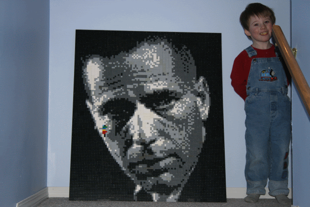
Finn poses with the work, mouth stuffed with cookie. I took these shots at the middle landing of the basement stairs, as I could get far enough away to take the shot, without a lot of other stuff in the picture.
The Bogart mosaic is still one of my favorites, for it’s simplicity and design. It was around this point that my “style” became greyscale photo mosaics. There was another defining style to come, but we’ll get to that about 4 entries from now. Thanks for taking an interest, and come back often!
1 Comment
Keith • August 18, 2010
I love this one. Finnys contribution also rocks!
Would you like to share your thoughts?