(This entry is part of a look at early mosaics I’ve made).
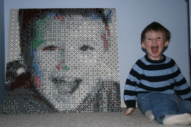
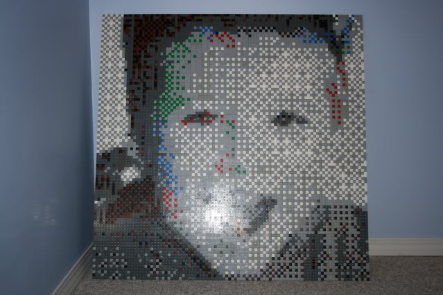
The Finny mosaic was the first one where I really started to think that some very cool things were possible. It was sizable enough, and well defined so that the subject was very clear. I used a different diffusion technique to make the image, one that I didn’t go back to. Too “pixely” for my taste. Also, for whatever reason, the digitization added some shades of red, green and blue. I decided on a whim to leave these in. (You’ll see in future mosaics that this sort of decision making is fairly common.

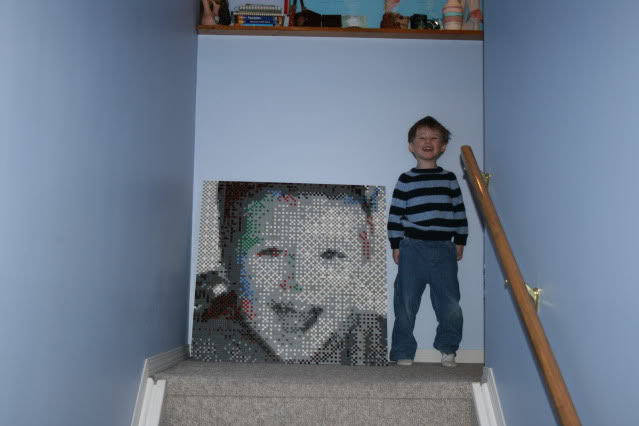
This is my favorite picture of this mosaic, as the subject was willing to recreate the pose live on the spot. This also started a trend of Finny appearing in at least one picture I take of each work. I use him as a gauge of scale, though I still find that it’s difficult to truly understand the size unless you see them in person. I’ve often had people look at pictures of a mosaic, then later still be floored at the size.

In the close up picture, you can see the “cross hatching” used to make up the image. I’m not a big fan of this style, and haven’t done a lot of pieces using it. It just seems a bit too pixelated to me.

Often, the further away you are, the more mosaics make sense. Especially smaller ones. You’ll often see single panel (one baseplate) mosaics on the web where the photo is taken from across the room. There’s a reason for that.
So there you have it. The mosaic that started a string of mostly grayscale mosaics. I haven’t done a mosaic of Finny since, maybe I’ll have to make a Finny and Max picture soon.
Tagged: Brickwares, Calgary Lego, Calgary Mosaic, Dave Ware, grayscale mosaic, greyscale mosac, Lego art, Lego Mosaic, Mosaic
0 Comments
Would you like to share your thoughts?