The Stampede mosaic I made this year marked the twentieth mosaic that I’ve made. Full disclosure, the very first one was lost to the ages with no photos, a mosaic of my sweet dog Molly, made on a 32×32 baseplate, mostly black, grey, and blue. There was also an album cover I began, but quickly grew bored with and abandoned. But let’s not quibble. Twenty it is. I guess the first six would be what is referred to in the literary world as my “juvenilia”, after a fashion.
The idea to make mosaics came from a trip to the Science Center, where the LEGO Egypt exhibit was on display. I loved the tapestry recreation. Here it is.
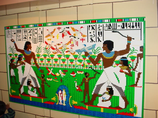
I started wondering if I could make something as cool as that. I’m still working on achieving that.
In the beginning, I had no idea what to do, so I just started making pictures. Also, I spent a lot of time on the internet, seeing what was possible, and what others were making. By far, the most interesting and involved work was made by Eric Harshbarger. While I don’t think my work resembles his in any way, I took a lot of encouragement and vision from his creations, and consider him a bit of a mentor. I’ve never met Eric, but I thank him in my head quite often.
Onward.
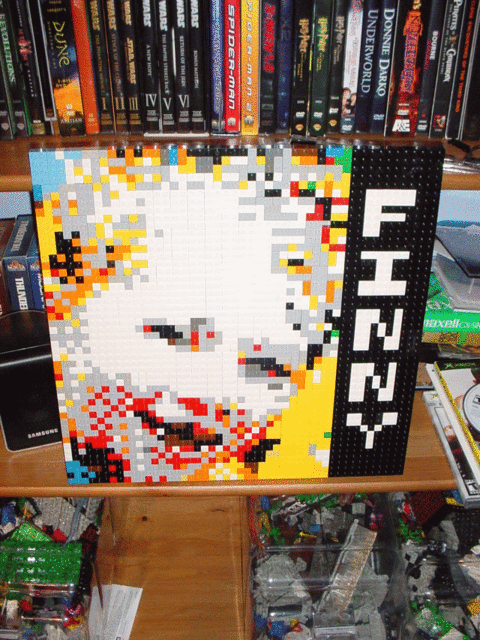
Finny (2006)
The first mosaic I built, and in glorious color. a single 48×48 baseplate, a large black bar down the right hand side, and a lack of cohesive background. Still, it’s my first, and I like it, weird green brick in the bottom right corner and all. Little did I know where it would all lead.
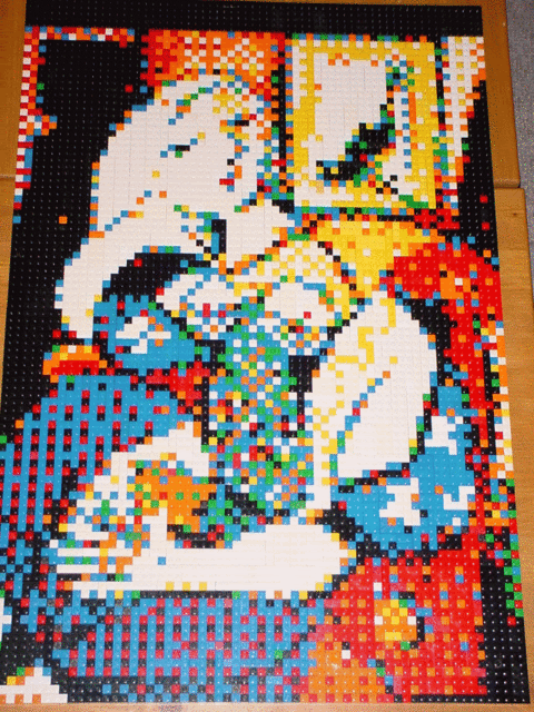
Woman With Book (2006)
Not one to take baby steps, the next mosaic was over 3 times as large as the first. It’s based on Picasso’s work of the same name. I’ve owned a print of this picture since I was in college, and I’ve always loved the colors and the simplicity of it. I decided to see if I could make it work in bricks. Turned out pretty well. Again, a lot of extra unneeded splashes of color, but a bit clearer. I’m still threatening myself to attempt a version of “Guernica”.
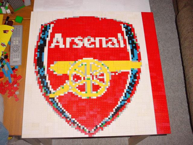
Arsenal (2006)
Around this time, I decided that the simplest pictures would be logos. Arsenal is my favorite soccer team, they play a very beautiful game, lots of pace, passing, and style. So i decided to try their crest out. Used a different program to pixelate this one, and i’m not happy with the blue areas. On the plus side, I had to change the design to make the Cannon’s wheel work properly, and learned that while computers can help a lot, you still have to get in there and make the mosaic your own.
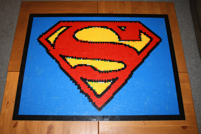
Superman (2006)
This one will always stick out for me as the mosaic that taught me many lessons about mosaics. The biggest one is that easy is easy. It doesn’t take a lot of skill or effort to fill in giant areas of single colors. This was the fastest mosaic I’ve ever made, and as a result, it was a bit…boring. This one ended the big logo experiment.
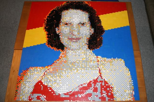
Katie Color (2007)
This one was renamed after I made a second mosaic of my lovely wife. The second attempt was one of my favorites. This mosaic doesn’t quite live up to the subject, and suffers from extreme dithering of the image. Also, I clearly ran out of brick for the background, as there’s no good reason for a red, yellow and blue background. On the plus side, I experimented with shadow and outline, and you can make out what the picture is.
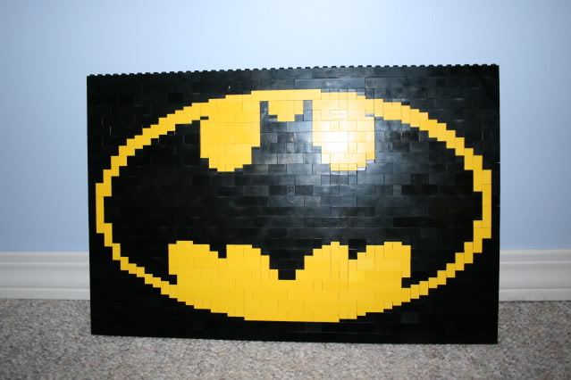
Batman (2007)
this Mosaic is unique among my work, in that it’s the only piece I’ve made “studs up”. That’s a LEGO term, meaning that the studs on the top of the brick are facing upward, rather than outward (towards the viewer). For this type of mosaic , you don’t use a baseplate, but rather you build a wall with a picture on it. It’s also the only mosaic I’ve made with plates in addition to brick. (the plates are the little flat pieces). This style allows for much more detail as 3 plates equal 1 brick in height, thus you can make angles and curves more easily. Another Logo, but I wanted something easy for the attempt.
So, that’s the early stuff. After these come the mosaics that are more similar to my current style. More on those in later articles. Thanks for joining me for the equivalent of looking back at your high school yearbook. Many zits, my friends, many zits.
Tagged: arsenal, batman, Brickwares, Lego Batman, Lego Mosaic, superman, superman lego
0 Comments
Would you like to share your thoughts?